As I’ve mentioned in a previous post some time ago, I’m a massive fan of physical books.
A lot of independent authors, especially with special editions, go to the other end of the scale: ornate, ostentatious and elaborate. That’s fine. Personally, though, my philosophy with physical books is that less is more.
In this post, I want to outline the key fundamentals that can transform a manuscript from something that looks like a Word document uploaded to Amazon KDP at 2AM into a book that readers almost forget was independently published at all.
You don’t need fancy typography knowledge to make a paperback book look professional; you just need to avoid the obvious traps and respect conventions.
Unfortunately, self-publishing has a stigma of being low-quality, and this is a stigma that many authors work assiduously to counter, especially with the growth of the independent publishing ecosystem of authors, formatters, cover designers, editors and other creative professionals who all have something to bring to the table. However I do still see books that fall into the trap – not through malice on the part of their authors, but because they’re simply unaware of conventions and carry on blissfully unawares.
Why is this important? Well, for customers and readers that choose physical books – there’s a reason for that, and the number one reason is that they want to read it in physical format. Books are not just judged by their covers, how the interior is presented is part of the product too, and if it’s wrong or looks sloppy or amateur, we can disappoint our readers or set their expectations before they have read a single word.
The printed text as it appears is literally our product – it’s how our story is being presented, so making it look professional, attractive and easy to read is a key consideration I feel gets left by the wayside more often than it should – and it’s not difficult either.
Also, readers largely come to independently published books from an established diet of traditionally published books. The traditional publishing industry has set standards – for better or worse – that people expect from physical books; if we want to avoid the largely-avoidable stigma that still surrounds independent publishing, we need to not be iconoclasts; we need to be aware of those standards and adhere to them as best we can – whether we want to or not becomes immaterial; the reader expects it.
Justified Body Text
Fully justified text is standard in fiction, and if you do nothing else, please justify your text. Open any book you see and you will see the text is neatly placed within the margins with no ragged edges, and it looks… uniform, consistent… and pleasant to read.
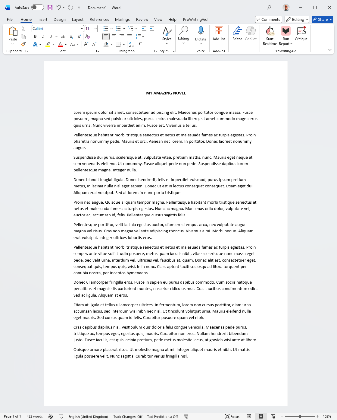
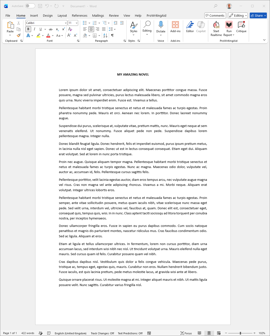
Leaving your text looking ragged along the right looks both untidy and telegraphs that you may have just slung the Word doc you wrote it in up on KDP at 2AM the night before. It looks amateur, it looks like “printed Word doc” and it looks self-published.
For genre fiction, while there can be some esoteric exceptions to the rule, the expectation is your text must be justified. This isn’t a flowery accoutrement either; open any traditionally published fiction book and you will see the text – whether it’s well written or not – is justified.
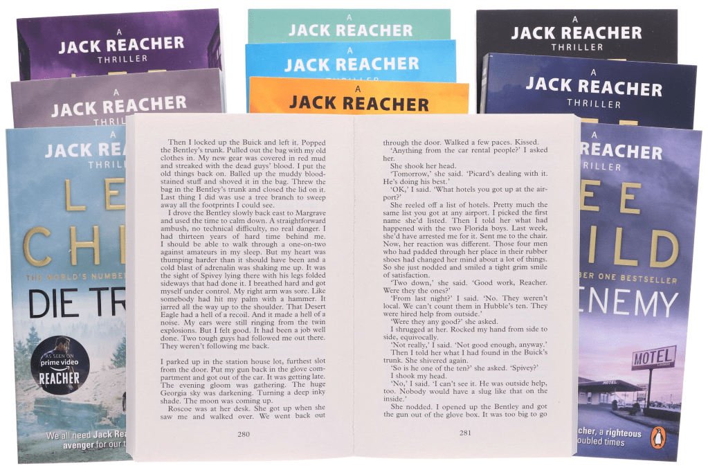
Even the most commercial fiction such as the Lee Child Jack Reacher books, which have scant formatting choices, ensure the text is justified into neat blocks on each page. These books are unashamedly commercial – there’s no frills, but this is a convention even the most utilitarian of formatting adheres to.
Proper Margins/Gutters
A lot of indie books have text shoved way too close to the spine, and way too close to the edge.
Text that ends up in the gutter – the crease where the pages are bound, is hard to read, and you have to fight with and mangle the book to read.
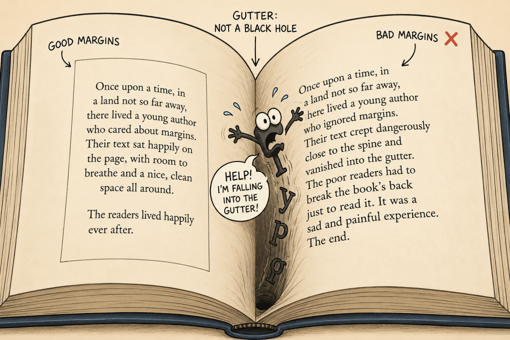
As a general rule, your inner margin – the gutter – needs to be wider than your outer margins, which in turn should be slightly smaller than your top/bottom margins for balance.
If you’re not sure – crack open one of your books on your shelf and observe for yourself. I recall when I was preparing The Landlady for its paperback release, I literally had a ruler and notepad out when comparing one of my traditionally published books.
Most dedicated formatting programs will account for the margins and gutter, but if you’re formatting your book manually, it’s often overlooked until you’ve ordered a box of 50 and realise you’ve made a small but expensive error.
The text itself should not be too crowded on the page – this feels claustrophobic and exhausting to read, but neither should there be massive gaps and expanses of blank space between each line. The page should feel readable, calm, even and balanced.
Line Spacing
For my books, I tend to aim for no more than 35 lines of body text per page or thereabouts.
Paragraph Indents
Another classic amateur tell is when, in fiction, the first line in each paragraph is not indented.
You should not use a “blank line” between each paragraph – unless you are inserting a scene or ornamental break.
The first line of each paragraph should always be indented (experiment to find an indentation size that suits you and matches your contemporaries. I tend to go with about 6-8mm; the default setting in Word is 12.7mm which is too big).
You should also always ensure your first-line indents are managed through the Paragraph styles in your word processor and not manually added using the TAB key as this will cause you a world of pain later on.
However, there are exceptions to the first line indent convention:
- The first paragraph of a new chapter.
- The first paragraph after a scene break
Both should NOT use a first-line indent. You may choose to use a drop-cap for the first paragraph in new chapters.
Hyphenation, Widows and Orphans
Hyphenation is a “hidden” sign of quality. Without hyphenation, justified text gets ugly quickly as lines are “stretched” to meet the margins and rivers of whitespace start cracking through the body text.
Bad or overdone hyphenation is also unattractive, ugly and an “amateur tell” that is telegraphing to your audience that you may not have paid as much attention to the literal text they’re reading as you may want them to.
Aim for a “Goldilocks” approach – not too little, not too much, but something that looks right.
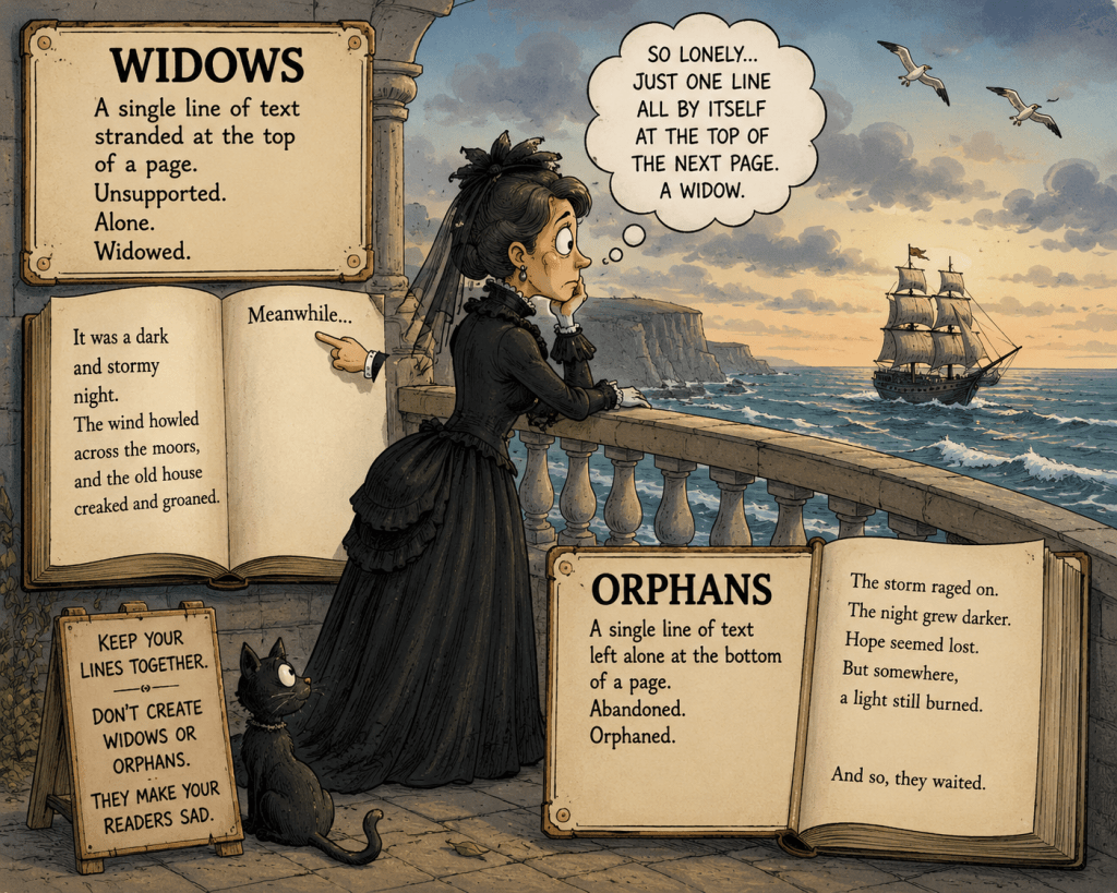
Widows and orphans, too, should be eliminated wherever possible as they look unattractive and amateur. Readers won’t consciously spot this, but it’ll feel “off”.
Good paragraph formatting involves making subtle tracking adjustments, spacing tweaks and paragraph management – you may need to tweak specific paragraphs. Do not just apply a single style and assume it’s taken care of (if you’re manually formatting); and even if you’re using a dedicated formatting program, check the output.
Chapter Start Consistency
Pick a style or theme for your chapter start pages. This style should include the following choices:
- Chapter heading font and font style (bold, size etc.)
- Spacing above and below your chapter header from the top of the page and where the text begins underneath.
- Whether every chapter will start on the left-hand page, right-hand page or next page regardless of what side it falls on.
- Drop caps
Headers and footers
Headers and footers are easy to add, but also easy to be caught out by. The general rules are:
- Your “front matter” should not use a header or footer.
- Chapter start pages should not use a header or footer.
- Author name usually goes at the top of the lefthand page; the book title (or chapter title) on the right-hand page
- Page numbers follow the same conventions but should be on the outside corners or centred.
Font Choice
There are many choices for fonts for your body text (I have a page where I keep an index of fonts I like here) – however, when choosing a font for your text, consider the following:
- Sans serif fonts like Arial, Calibri and Helvetica are never appropriate for printed body text. Serif fonts like Minion Pro, Garamond, Caslon and Palatino are much better suited to physical reading.
- Try to avoid fonts such as Times New Roman as these are very trite “default” fonts that can, again, make your book look like “a printed Word document”.
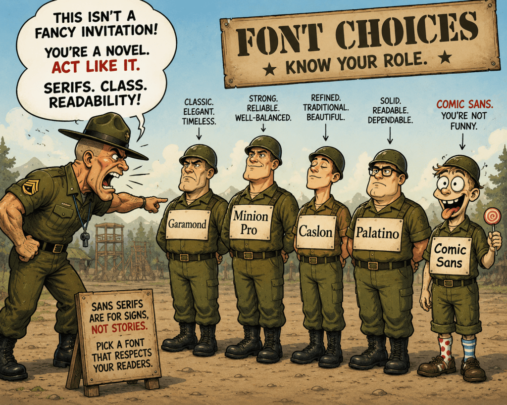
A good font choice – one that doesn’t feel default and is comfortable to read makes readers feel the difference even if they can’t quite articulate why.
Don’t use Word for layout!
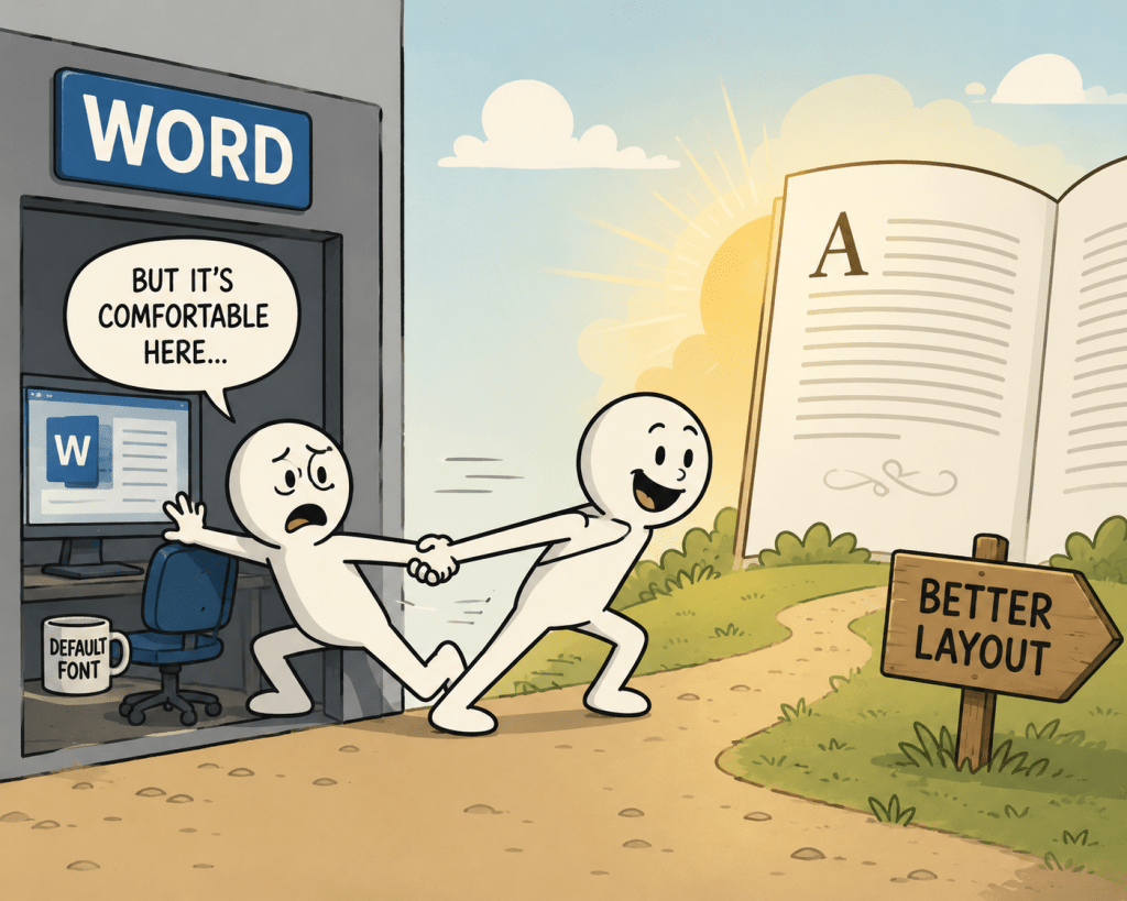
I will elaborate more on this in a future followup to this post but, for the love of God, please avoid using Microsoft Word, Google Docs or similar programs as they are not designed for page layout and make all of the above pitfalls all the more easy to fall into!
Conclusion
These are the fundamentals that I think all independent authors should be aware of – you can choose to make different choices, of course – as independent authors, we have the freedom to make those choices. However, readers may not subconsciously notice good formatting, but they will absolutely notice bad formatting.
Good formatting is not just about following conventions – these conventions have evolved over decades, and likely will continue to subtly evolve. Good paperback formatting is mostly about removing friction, respecting conventions and ultimately making the reading – which is what your book is for – effortless and enjoyable.
The overwhelming majority of independent authors miss these details not because they’re intentionally doing so; I believe it’s because they are unaware, so this post (and those to follow) is aimed at educating my contemporaries and helping them make better books!
Please let me know if you found these tips useful!
(Yes, the cartoons were made with AI.)


Leave a Comment